Introduction
Album covers from the 1970s and 1980s weren’t just protective sleeves for vinyl records—they were visual invitations into the sonic worlds that musicians carefully crafted. These images were gateways, telling a story before the needle even touched the record. From surreal spaceships and soaring eagles to whimsical illustrations and bold typography, album covers became cultural artifacts that stood as symbols of identity, rebellion, and artistry. Today, in an era where digital music often lacks the same physical artistry, revisiting these covers through the medium of colored pencil drawing is both a tribute and a creative exercise. Colored pencils, with their rich textures and layering abilities, are uniquely suited to capture the detail, vibrancy, and nostalgic warmth of these iconic designs.
The 70s and 80s were particularly fertile ground for imaginative cover art. Bands weren’t afraid to go big, strange, or fantastical, leaning into themes that elevated their music to something mythic. Consider Boston’s spaceship guitars, Queen’s theatrical emblems, or Rush’s owl spreading its wings against a stark night sky—these weren’t just pictures, they were dreams. They begged to be recreated, and for today’s artists, colored pencils provide the perfect tactile, hands-on way to bring these covers back to life. Unlike paint or digital tools, pencils allow for intimate blending, precision in small details, and a personal touch that mirrors the handcrafted spirit of the original artworks.
Drawing these covers isn’t just about nostalgia—it’s about learning how to balance bold compositions, contrasting colors, and intricate details. Each album cover provides its own challenge: metallic reflections, surreal landscapes, or delicate typography. For anyone looking to explore album cover recreations, the 70s and 80s provide some of the most exciting source material imaginable. Not only do they serve as great practice for color theory and rendering techniques, but they also carry the cultural weight of music history, reminding us why physical album art mattered so much in the first place.
In this article, we’ll dive into six specific covers—Boston’s Don’t Look Back, Queen’s A Night at the Opera, Journey’s Greatest Hits, Electric Light Orchestra’s ELO, Styx’s Magic Man, and Rush’s Fly by Night. We’ll also explore other iconic designs from the same era that beg for colored pencil interpretation, from the surrealism of Pink Floyd to the pop-art boldness of David Bowie. Along the way, we’ll look at what makes each cover a rewarding artistic subject, how to approach its textures and colors with pencils, and why recreating them can be as fulfilling as listening to the albums themselves.
Boston – Don’t Look Back: The Spaceship Guitar Fantasy
Boston’s Don’t Look Back is one of the most visually iconic covers of the 70s, featuring a fleet of guitar-shaped spaceships soaring away from a fiery Earth-like planet. It’s science fiction meets rock and roll, and it perfectly embodies the band’s soaring, cosmic sound. For colored pencil artists, this cover presents an exciting challenge. The glowing blues of the planet, the fiery reds of the atmosphere, and the sleek metallic reflections of the ships require careful layering and blending to achieve the illusion of light and depth.
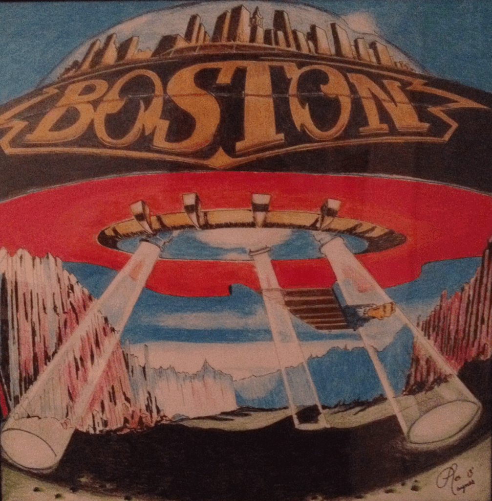
One of the joys of drawing this piece is capturing the balance between hard-edged precision and dreamy gradients. The guitars-as-spaceships must retain crisp outlines and metallic sheen, while the planetary glow calls for smooth transitions between blues, purples, and whites. Colored pencils allow for gradual layering, making it possible to render that ethereal glow without harsh lines. For artists, this cover is a masterclass in capturing both mechanical precision and atmospheric softness.
From a cultural standpoint, Boston’s cover also exemplifies the optimism and futurism of the late 70s. Rock music was still about exploration, pushing boundaries, and imagining bigger possibilities. That theme carries over beautifully into the art, and recreating it becomes an act of channeling that same energy. It’s more than a drawing—it’s a celebration of the belief that music could literally take us to new worlds.
As an art project, this cover demands patience and planning. The intricate details of the guitar ships require fine control, while the planetary backdrop benefits from broad, blended strokes. Artists might experiment with burnishing techniques or solvent blending to achieve a smooth, almost airbrushed finish. The end result, when done with care, is a piece of colored pencil art that feels as epic as the music it represents.
Queen – A Night at the Opera: Whimsy Meets Elegance
Queen’s A Night at the Opera couldn’t be more different from Boston’s interstellar rock voyage. Instead of cosmic imagery, it features a whimsical, almost heraldic crest designed by Freddie Mercury himself. The crest combines astrological symbols, fairytale creatures, and ornate flourishes—an ideal subject for anyone who loves detailed, symbolic drawing. With colored pencils, this cover becomes a rewarding exercise in layering colors, creating contrast, and bringing symbolic elements to life.
The artwork features two lions (Leo, for John Deacon and Roger Taylor), a crab (Cancer, for Brian May), and two fairies (Virgo, for Mercury). At the center, a phoenix spreads its wings, uniting the design in a fiery display. The palette is a mix of jewel tones, delicate pinks and purples, and gold-like accents, all of which can be stunningly recreated with pencils. Artists get to experiment with both bold strokes for the lions’ manes and delicate touches for the fairies and flourishes.
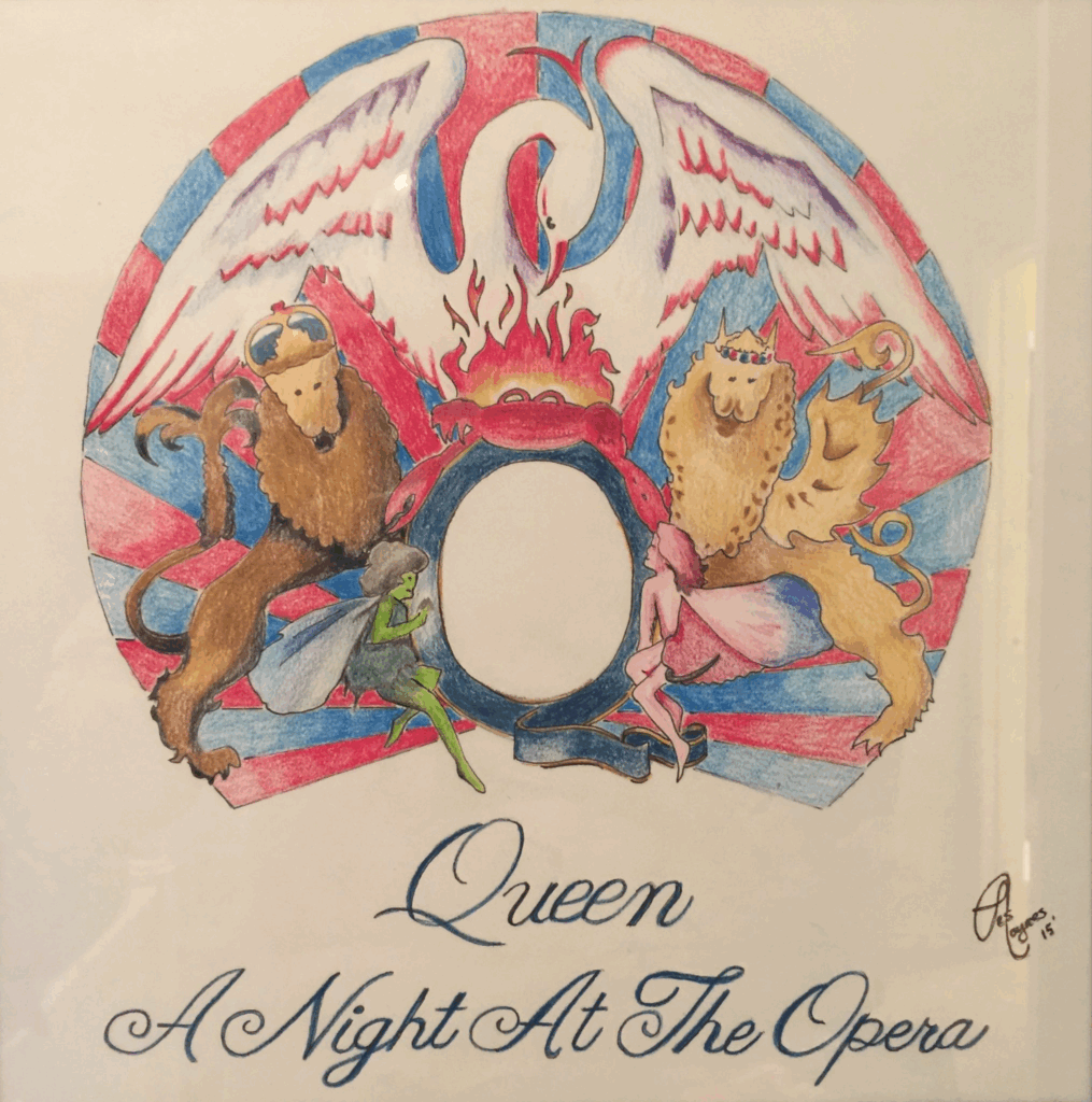
This cover works especially well as a colored pencil project because of its mix of strong outlines and subtle shading. Unlike Boston’s spaceships, Queen’s crest thrives on intricacy. Each creature and symbol demands attention, and colored pencils are ideal for rendering small details like feathers, fur, and facial expressions. For those who enjoy working meticulously, this cover can feel like entering a world of miniature storytelling.
What makes this cover even more engaging is the theatrical flair behind it. Queen was never just a band—they were a spectacle. The cover reflects that flamboyance, and drawing it is almost like channeling Mercury’s sense of drama and imagination. As artists bring the crest to life in colored pencil, they’re not just copying an image—they’re stepping into the role of visual storyteller, crafting a piece that radiates both elegance and whimsy.
Journey – Greatest Hits: Timeless Design in Bold Color
Journey’s Greatest Hits cover is instantly recognizable with its striking scarab beetle, fiery color palette, and symmetrical design. Unlike some covers that lean heavily into surreal landscapes or symbols, this one relies on bold geometry and intense saturation, making it particularly rewarding for colored pencil artists.
The scarab beetle, a symbol often tied to rebirth and eternity, takes on a futuristic glow here. Its wings stretch outward, bursting with color gradients that move from deep reds and oranges to electric blues and purples. For artists, this requires careful layering to achieve the luminous effect. Colored pencils, with their ability to transition smoothly between hues, are the perfect medium for replicating the energy and intensity of the design.
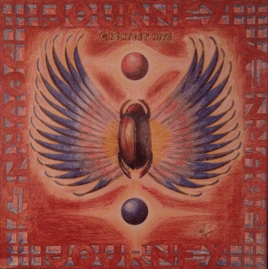
Symmetry plays a huge role in the success of this piece. Drawing it with colored pencils teaches patience and precision, since both sides of the scarab must balance perfectly. Unlike a looser design where imperfections can blend into the overall effect, Journey’s cover requires the artist to slow down, measure, and build the artwork deliberately. It’s a project that demands discipline but rewards with a stunning final product.
The cultural significance of this cover can’t be ignored. Journey’s music, particularly in the 80s, was about grand emotion and universal themes. The scarab feels timeless, almost mythological, which mirrors the lasting popularity of songs like Don’t Stop Believin’. Drawing this cover isn’t just about capturing color—it’s about embodying the sense of endurance and energy that defines Journey’s legacy.
Electric Light Orchestra (ELO) – The Futuristic Spaceship
Electric Light Orchestra (ELO) leaned heavily into futuristic imagery, and their covers remain some of the most visually arresting of the era. The ELO spaceship—modeled after a glowing jukebox-meets-spacecraft—became an enduring symbol for the band. For artists, it’s an irresistible subject because it combines metallic textures, glowing lights, and surreal design.
Drawing the ELO spaceship with colored pencils is a chance to experiment with reflective surfaces. The cover art relies on chrome-like highlights, neon bands of color, and glowing edges that require both subtle gradients and sharp contrasts. Pencils allow for layering metallic tones—silvers, grays, blues, and reds—in ways that mimic the look of reflective surfaces. Artists might even incorporate blending techniques with a colorless blender to smooth transitions and heighten the illusion of shine.
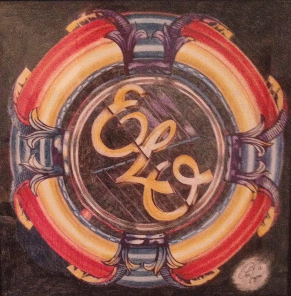
What makes this cover especially fun is its sense of motion. The spaceship seems to hover and glow, as though it’s about to blast off into space. Capturing that energy with pencils requires more than just technical skill—it’s about suggesting movement through shading and light placement. The payoff is a final piece that feels alive, almost humming with the same vibrancy as ELO’s lush orchestral rock sound.
Recreating this cover also connects an artist with the playful, experimental spirit of the 70s and 80s. ELO wasn’t afraid to merge rock with classical influences, or to embrace futuristic aesthetics in their visuals. Drawing their iconic spaceship in colored pencil is an homage not only to the art but to that adventurous spirit of blending genres and mediums.
Styx – Magic Man: Mysticism and Rock Energy
Styx’s Magic Man (often remembered alongside the band’s other fantastical covers) taps into mystical, surreal imagery that begs to be reinterpreted with colored pencils. The artwork features swirling colors, cosmic motifs, and dreamlike compositions that reflect the band’s mix of theatricality and rock energy.
Colored pencils are ideal for rendering the swirling, almost psychedelic textures of this cover. The medium allows for soft transitions between bold, clashing hues—reds melting into blues, purples swirling into yellows—without losing the richness of each tone. For artists, this cover is less about precision and more about capturing energy and atmosphere. It’s a chance to loosen up, experiment with blending, and embrace the dreamlike quality of the art.
Thematically, the cover is a celebration of mystery and imagination. Styx often leaned into grand, sometimes fantastical storytelling, and the cover reflects that sensibility. Drawing it allows an artist to dive into surrealism, practicing how to depict abstract ideas with color and form. Unlike covers that require meticulous symmetry or realistic rendering, this one invites freedom, creativity, and personal interpretation.
From an SEO standpoint, Styx’s covers represent the mystical side of rock album art in the 70s and 80s. They reflect the era’s willingness to lean into bold visuals that matched the grandeur of the music. For artists, recreating Magic Man is both a technical and emotional journey, capturing not just the look of the design but the feeling of stepping into a world where rock music becomes myth.
Rush – Fly by Night: The Owl in the Night Sky
Rush’s Fly by Night cover is simple yet unforgettable, featuring a great horned owl spreading its wings against a stark, starry night sky. The composition is bold, direct, and filled with atmosphere, making it a perfect colored pencil project.
The owl itself is the centerpiece, and capturing its feathers with colored pencils is both challenging and rewarding. Feathers demand fine, layered strokes to create texture, depth, and softness. Colored pencils excel at this, allowing the artist to vary pressure, layer tones, and suggest the play of moonlight across the bird’s wings. The background sky, meanwhile, calls for smooth shading and subtle gradients to create the illusion of depth and mystery.
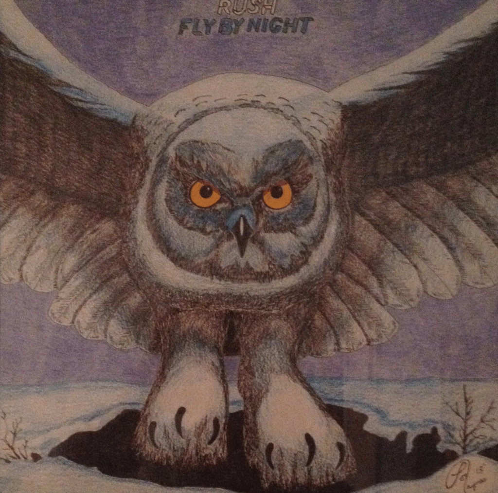
What makes this cover especially satisfying is its symbolic resonance. Rush was moving into a new era with Fly by Night, and the owl serves as a metaphor for wisdom, vision, and exploration. Drawing it becomes more than a technical exercise—it’s a way of connecting with the spirit of the album itself. The wide, glowing eyes of the owl seem to peer directly at the viewer, making the drawing process feel intimate and almost spiritual.
For artists, this cover provides an ideal balance between detail and atmosphere. The owl requires precision and attention to detail, while the sky allows for freedom and broad, sweeping applications of color. The end result is a piece that feels powerful, mysterious, and timeless—just like the music of Rush itself.
Other Album Covers Worth Recreating in Colored Pencil
The Eagles – One of These Nights
Released in 1975, One of These Nights features a hauntingly beautiful cover image designed by Boyd Elder (also known as “El Chingadero”), an artist who became known for his highly stylized, almost mystical depictions of skulls and animals. The cover showcases a stylized, painted steer skull adorned with feathers and intricate patterns, set against a dark, stormy background. Unlike the more realistic architectural setting of Hotel California, this design leans heavily into symbolism and mood.
For colored pencil artists, this cover is a treasure trove of textures and contrasts. The skull itself requires careful rendering of bone-like shading—subtle creams, grays, and browns—to give it a three-dimensional, weathered look. The feathers introduce an opportunity for delicate line work, soft gradients, and attention to detail, while the background allows for atmospheric blending of deep blues, purples, and blacks, creating a mysterious aura.
Thematically, the artwork captures the darker, more introspective tone of the album. Songs like the title track and Lyin’ Eyes reflect themes of longing, shadows, and emotional depth, and the cover art mirrors this mood perfectly. Drawing it with colored pencils is more than a technical exercise—it’s about capturing the eerie, almost spiritual vibe that Elder embedded into his design.
What makes this cover particularly engaging is how it balances minimalism with detail. There’s no sprawling landscape or cosmic spectacle here; the skull floats against a void-like background, commanding attention through stark contrast. This simplicity makes the drawing process very focused, demanding precision in rendering textures and subtlety in blending shadows.
Recreating One of These Nights also connects artists to a broader tradition of Western and Southwestern art, where skulls, feathers, and desert imagery hold deep cultural symbolism. By reinterpreting it in colored pencil, you’re not just recreating an album cover—you’re engaging with a visual language that ties into both music history and regional artistry.
Asia – Asia
Asia’s self-titled debut album (1982), with artwork by the legendary Roger Dean, is one of the most breathtaking examples of prog rock cover design. The cover depicts a giant sea serpent rising from the waves against a futuristic sky, complete with Dean’s trademark organic-mechanical aesthetic. The bright turquoise water, gleaming scales, and dramatic composition make it a dream subject for artists.
For colored pencil drawing, this cover offers multiple challenges and opportunities. The serpent’s skin requires careful layering to capture the illusion of shimmering, reflective scales, while the foaming waves call for smooth blending and textural techniques. The sky, with its surreal gradients and cloud-like forms, provides the chance to experiment with both color transitions and atmospheric effects.
Roger Dean’s covers are practically tailor-made for colored pencil practice. They combine natural textures, like rock or water, with fantastical elements, demanding creativity and technical skill. Recreating Asia isn’t just about copying the serpent—it’s about stepping into Dean’s imaginative world and bringing it to life through vibrant, hand-drawn color.
Triumph – Allied Forces
Triumph’s Allied Forces (1981) features a striking cover with bold geometric design and strong contrasts, a departure from some of the more surreal artwork of the era. The image combines metallic sheen, sharp typography, and dramatic use of light and shadow, echoing the band’s powerful, anthemic sound.
In terms of colored pencil work, Allied Forces offers a study in precision. The straight lines, metallic textures, and reflections challenge an artist to control their pencil strokes carefully and maintain consistency in shading. Metallic effects are particularly fun to experiment with, as layering grays, whites, and hints of blue can create a convincing chrome-like finish.
Unlike covers filled with whimsical creatures or cosmic landscapes, Triumph’s design focuses on boldness and strength. For artists, this becomes an exercise in contrast and clean execution. The sharpness of the imagery makes it stand out as a different kind of project—less whimsical, more industrial—but still deeply connected to the era’s love of impactful, statement-making visuals.
What ties all these covers together is their boldness. The 70s and 80s were eras when bands weren’t afraid to take risks visually, and their album covers reflect that. For modern artists, these designs provide endless opportunities to practice blending, shading, texture, and composition, all while connecting with some of the greatest music ever recorded.
Conclusion
Drawing album cover artwork from the 70s and 80s with colored pencils isn’t just an art project—it’s a nostalgic journey into an era when music and visuals worked hand in hand to create entire worlds. These covers weren’t disposable; they were integral to the experience of listening to the record. By recreating them in colored pencil, artists tap into that magic, revisiting the time when holding an album in your hands meant holding a piece of culture.
The six covers we explored—Boston’s Don’t Look Back, Queen’s A Night at the Opera, Journey’s Greatest Hits, ELO’s futuristic spaceship, Styx’s Magic Man, and Rush’s Fly by Night—each offer unique challenges and rewards. They teach us about texture, color, composition, and symbolism, while also reminding us why these bands mattered. They’re not just exercises in technique; they’re conversations with history.
Other covers from Pink Floyd, Led Zeppelin, Bowie, and beyond provide further opportunities to experiment and grow as an artist. Whether focusing on surreal landscapes, intricate details, or bold portraits, the possibilities are endless. Colored pencils, with their flexibility and richness, make the perfect tool for bringing these visions to life.
In the end, recreating album covers in colored pencil is more than homage—it’s a celebration. It’s a way of bridging the gap between music and art, past and present, listener and creator. As you sit down with your pencils and a classic album for inspiration, you’re not just drawing a cover—you’re keeping alive the spirit of an era where art and sound were inseparable, where imagination knew no bounds, and where every record was an invitation to dream.